
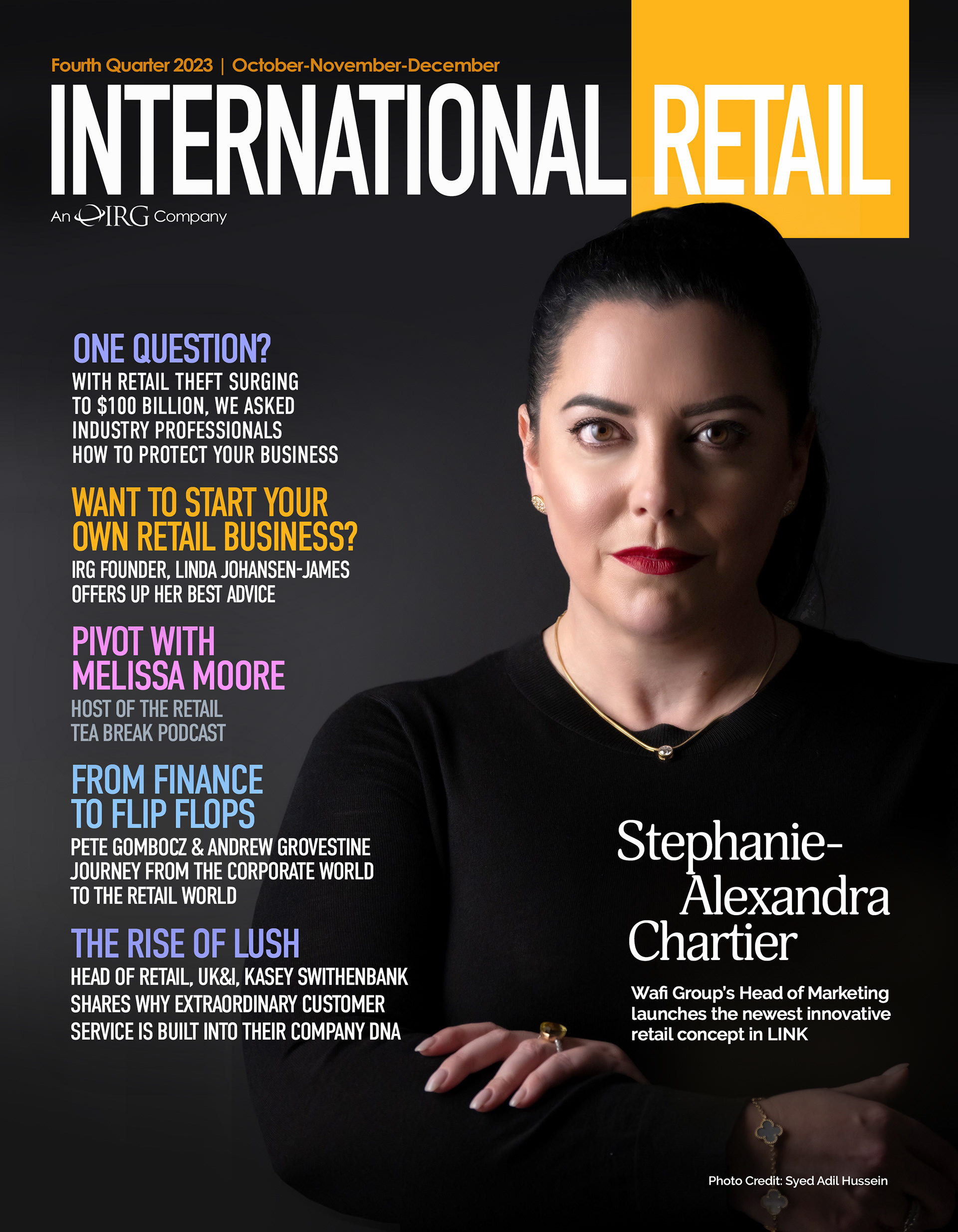
Stephanie-Alexandra Chartier, Wafi Group's Head of Marketing shares the latest in innovation for Retailers: LINK!


International Retail Fall/Winter 2023:
Stephanie-Alexandra Chartier, Wafi Group's Head of Marketing shares the latest in innovation for Retailers: LINK!
International Retail Spring/Summer 2023:
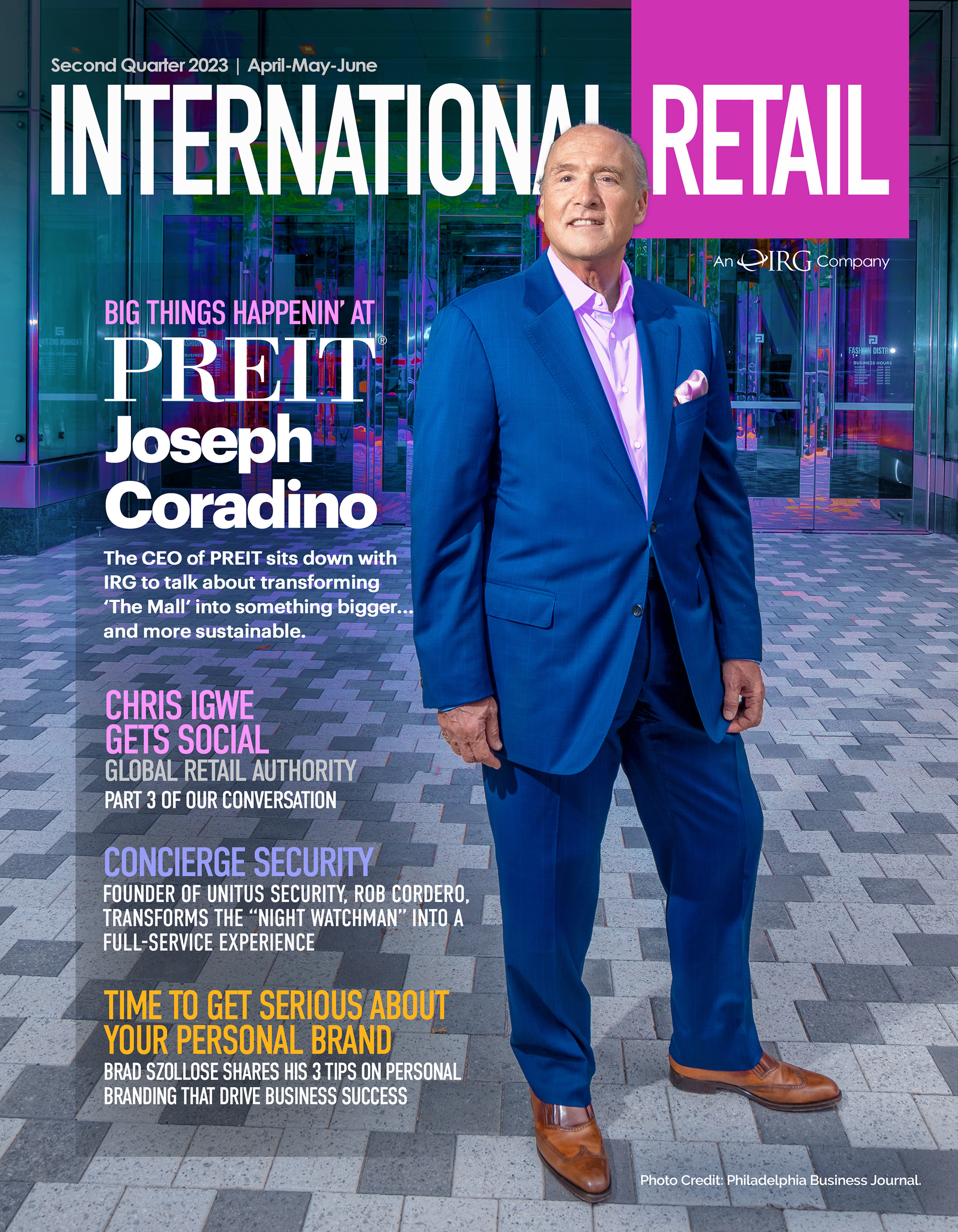
Joseph Coradino joins us for an honest discussion about PREIT: his failures and the turnaround...and the future of The Mall.
International Retail Magazine
Fall/Winter 2022
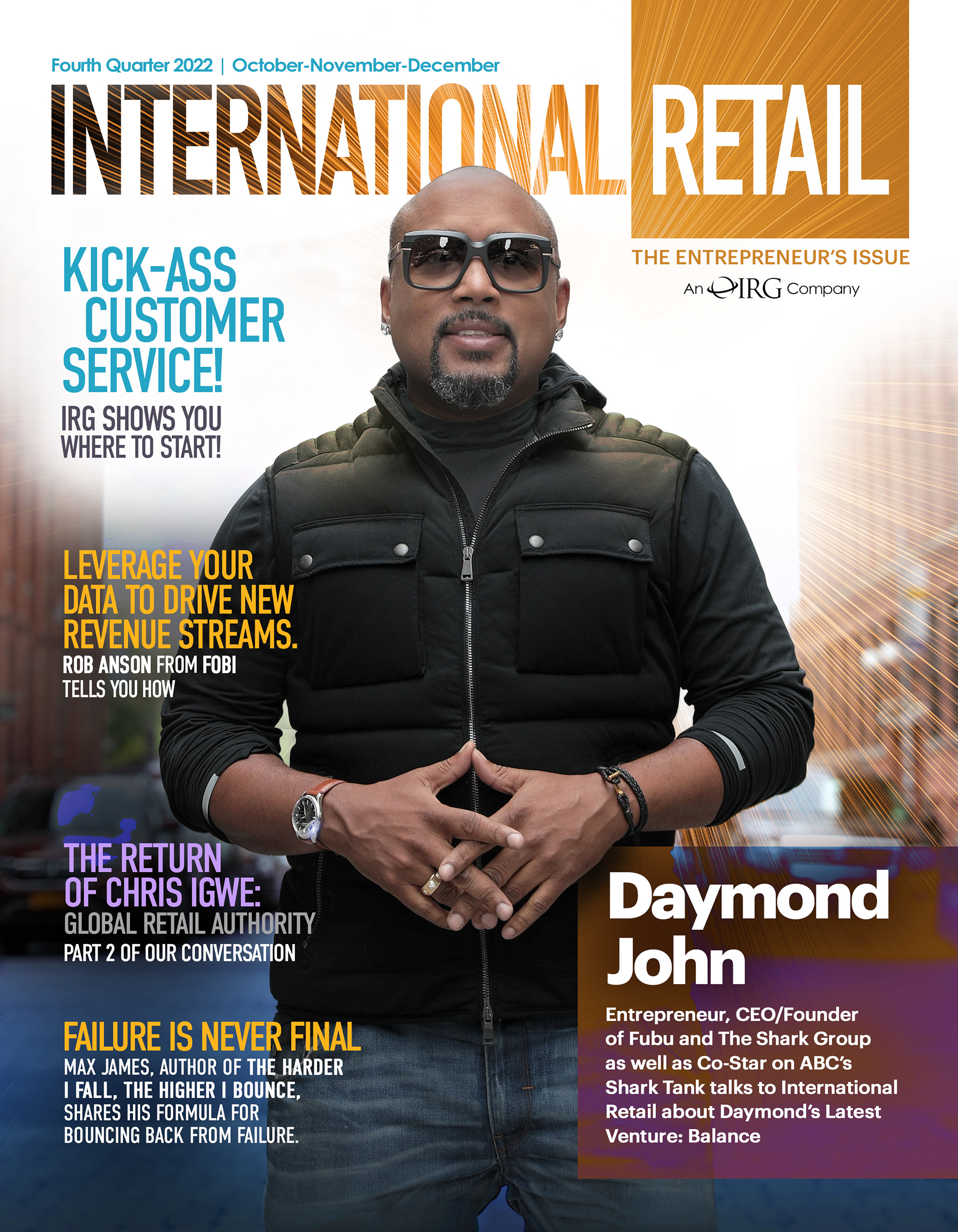
Daymond John of ABC's Shark Tank graces the cover as he shares his latest venture: Finding BALANCE.

International Retail Magazine
Spring/Summer 2022
The Global Voice of Retail, Chris Igwe graces our cover to share the latest shopping trends in Europe.
International Retail Magazine
Spring/Summer 2021
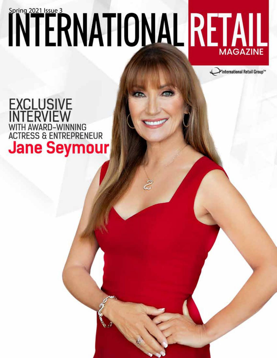
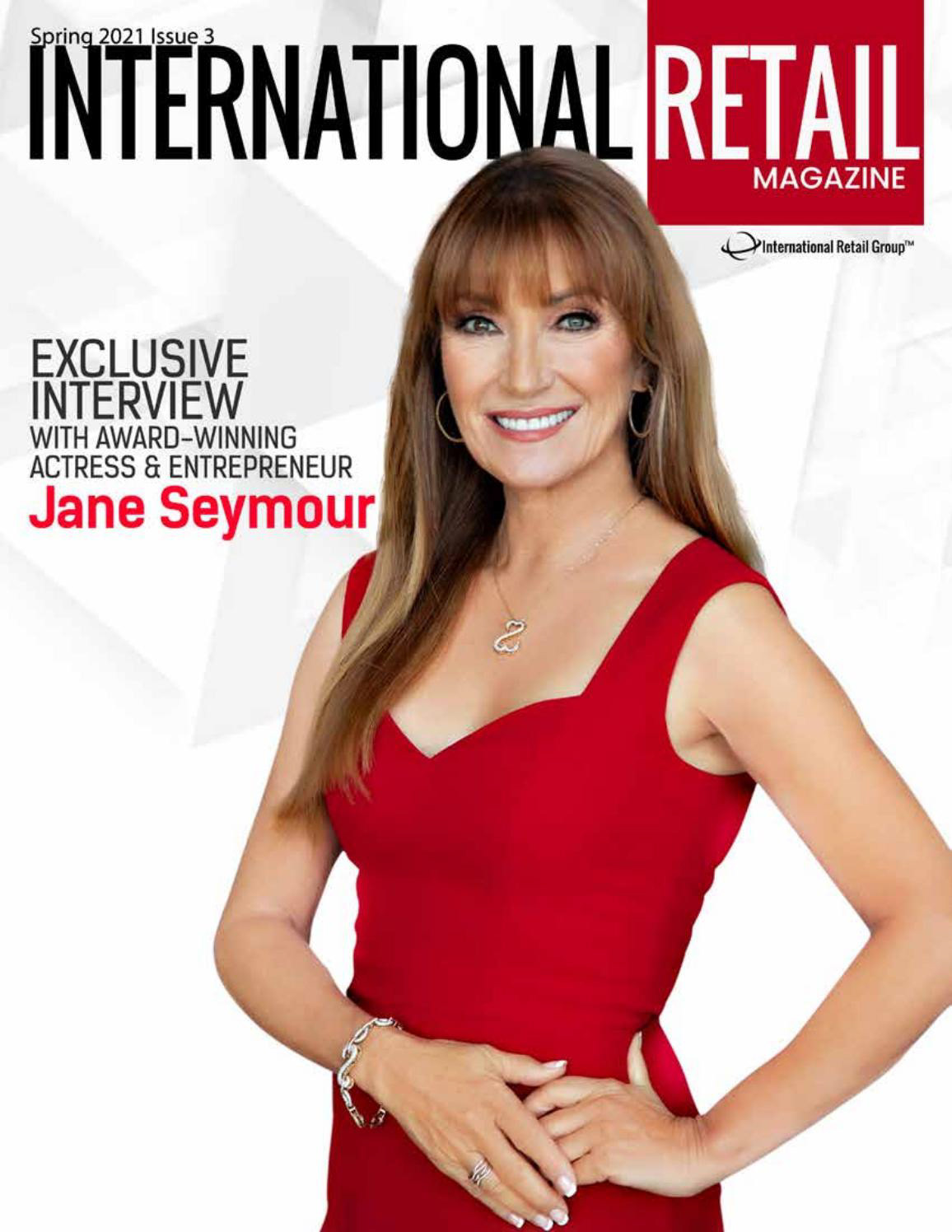
Jane Seymour graced our cover to share her entrepreneurial spirit and the secret to her youthful vigor.
International Retail Magazine
Fall/Winter 2020
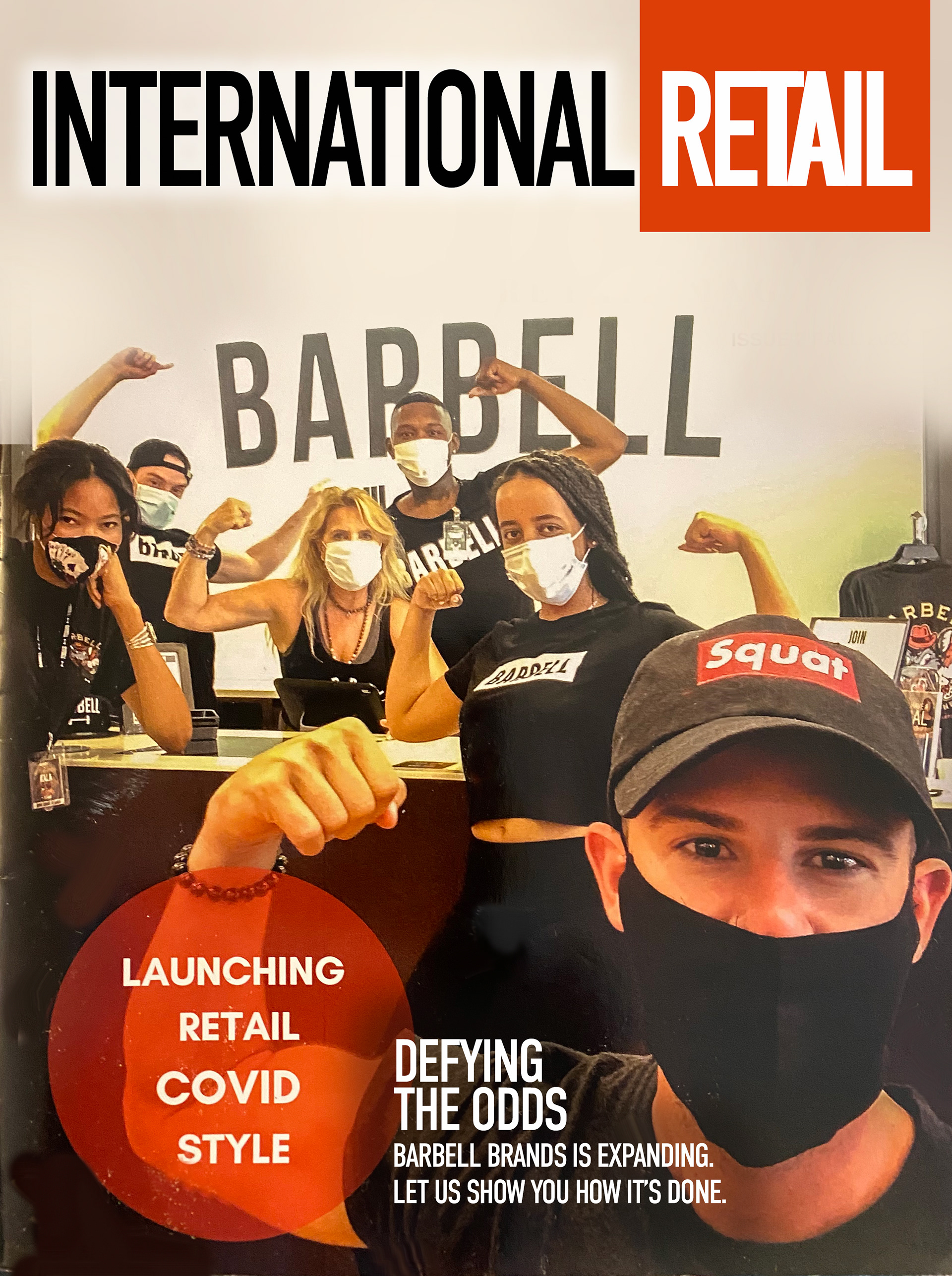
Linda Johansen-James interviews the founders of Barbell Apparel, and their extraordinary expansion during COVID.

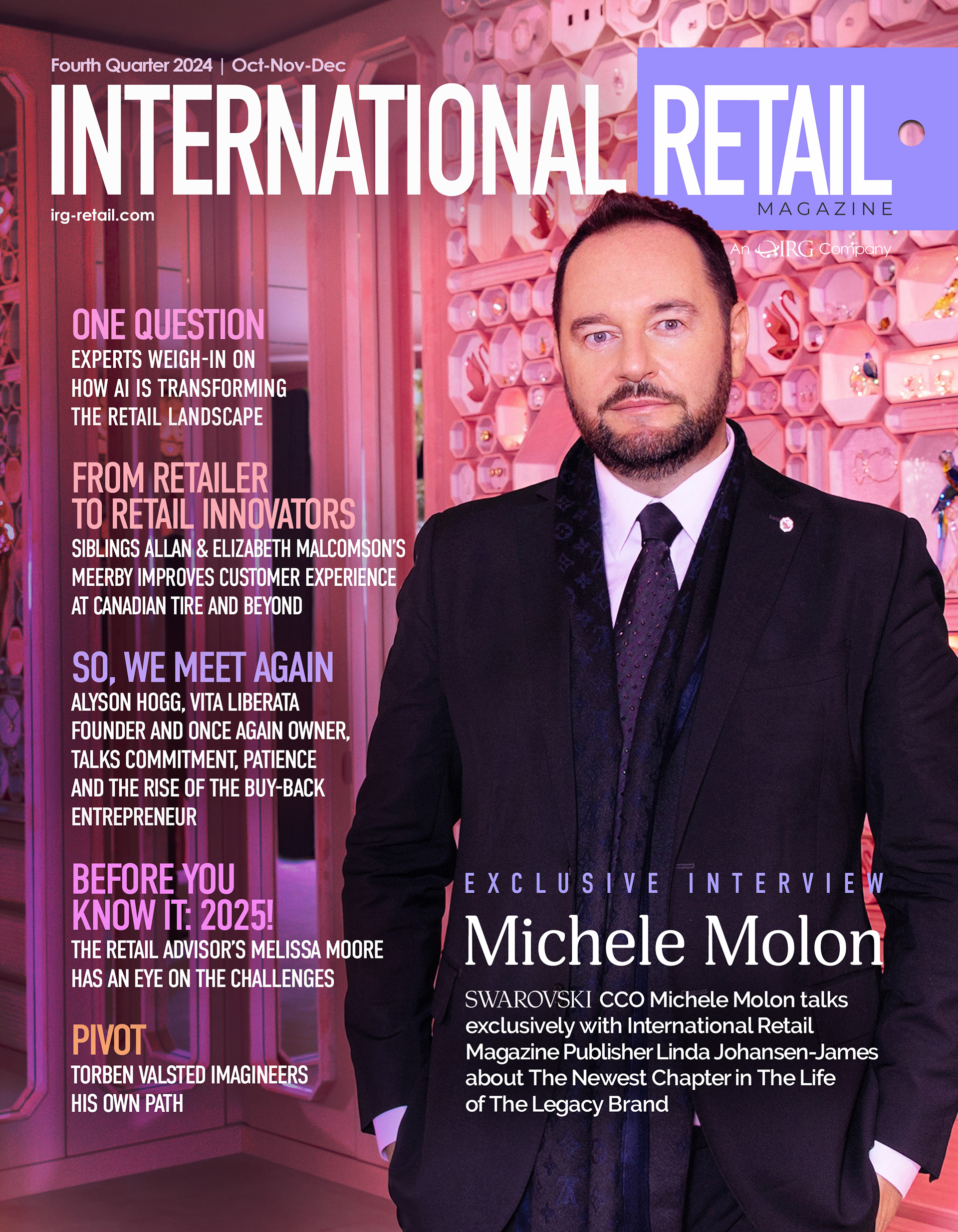
Michele Molon, CCO of Swarovski, talks about their new flagship store in NYC, the secret sauce behind their success and the global reach of this 129 year old Legacy Brand.

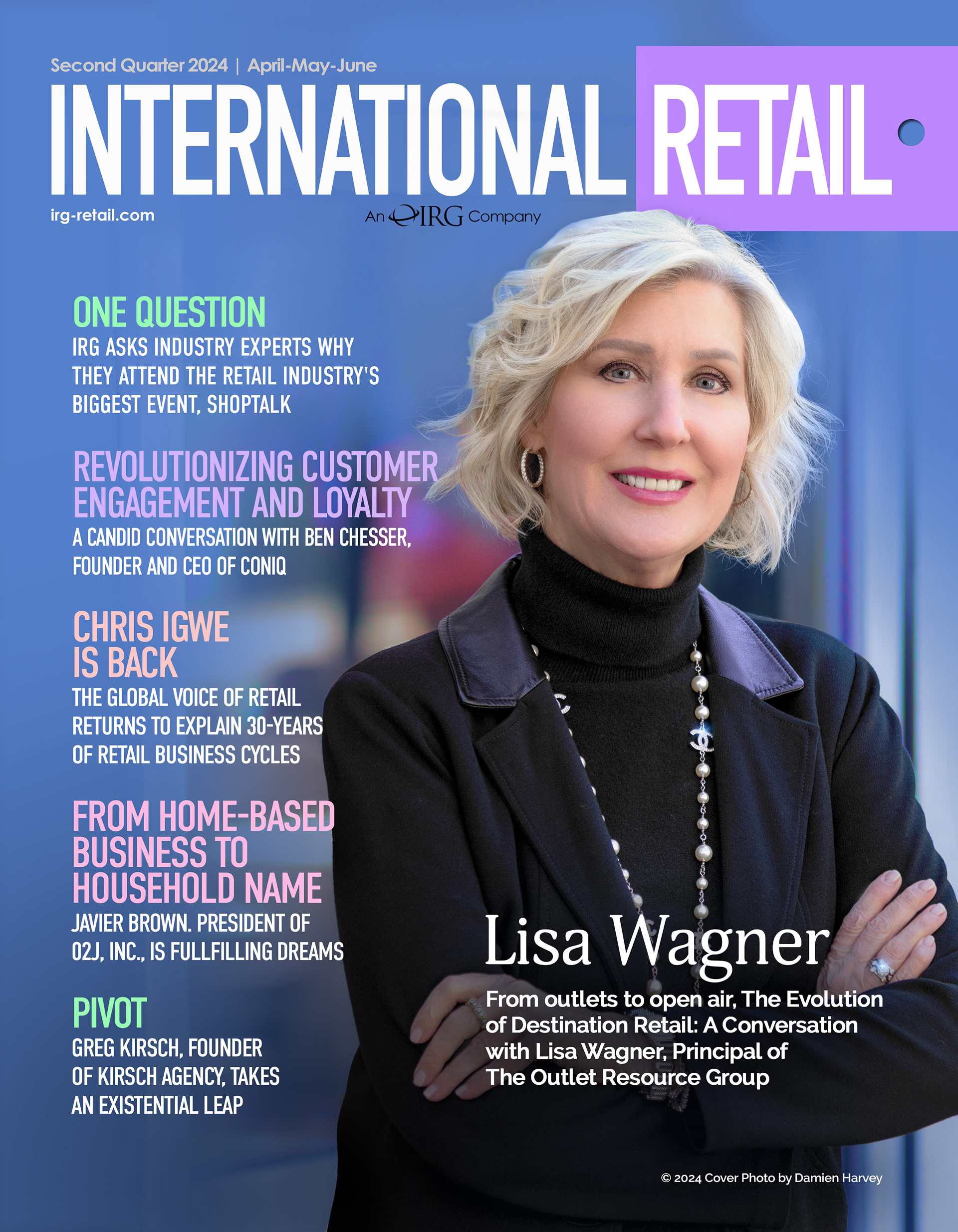
The Evolution of Destination Retail: A Conversation with Lisa Wagner, Principal of The Outlet Resource Group: Sping of 2024.

Stephanie-Alexandra Chartier, Wafi Group's Head of Marketing shares the latest in innovation for Retailers: LINK! in our Fall 2023 issue.

Joseph Coradino joins us for an honest discussion about PREIT: his failures and the turnaround...and the future of The Mall.
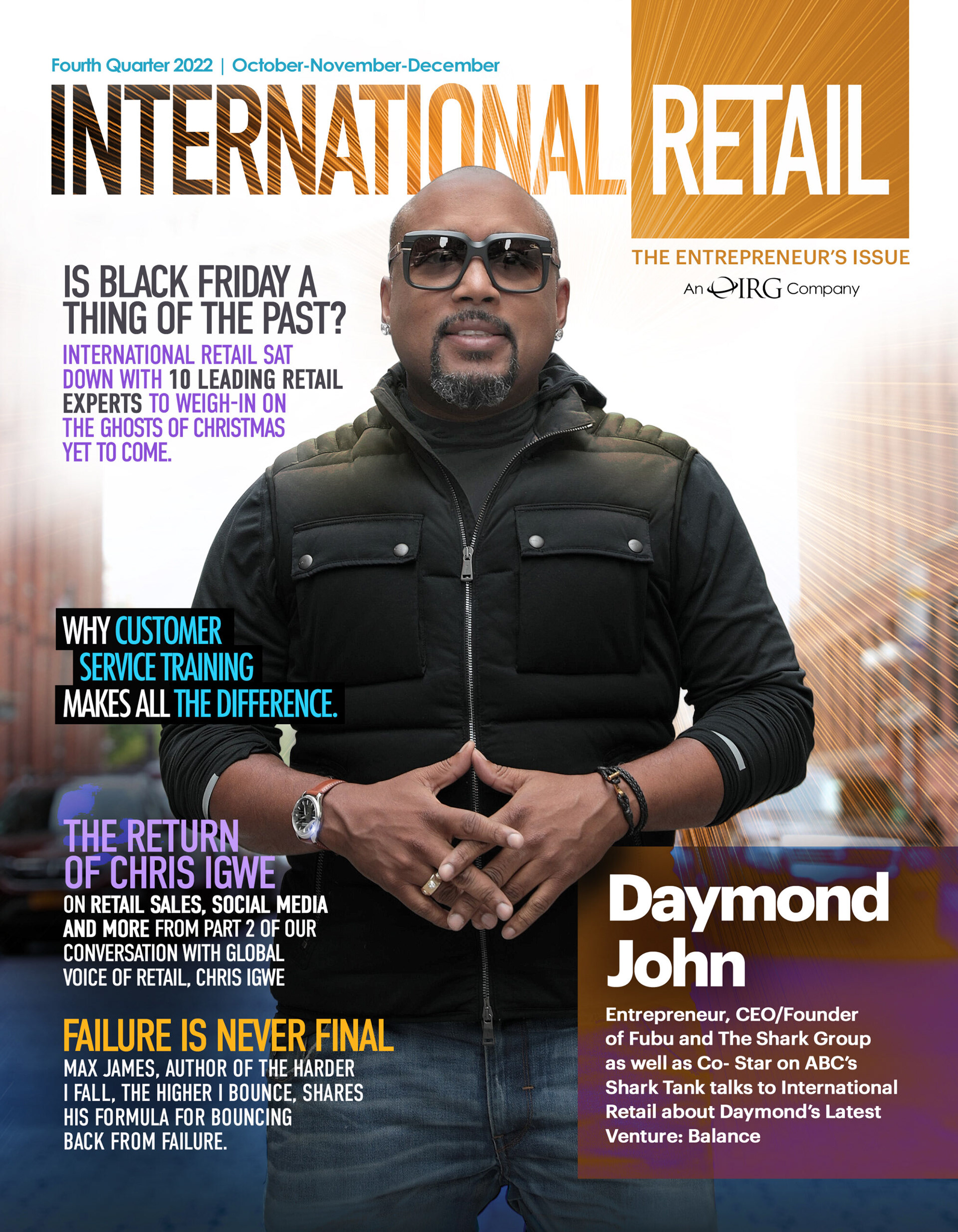
Daymond John talks about his Next Big Project: Balance
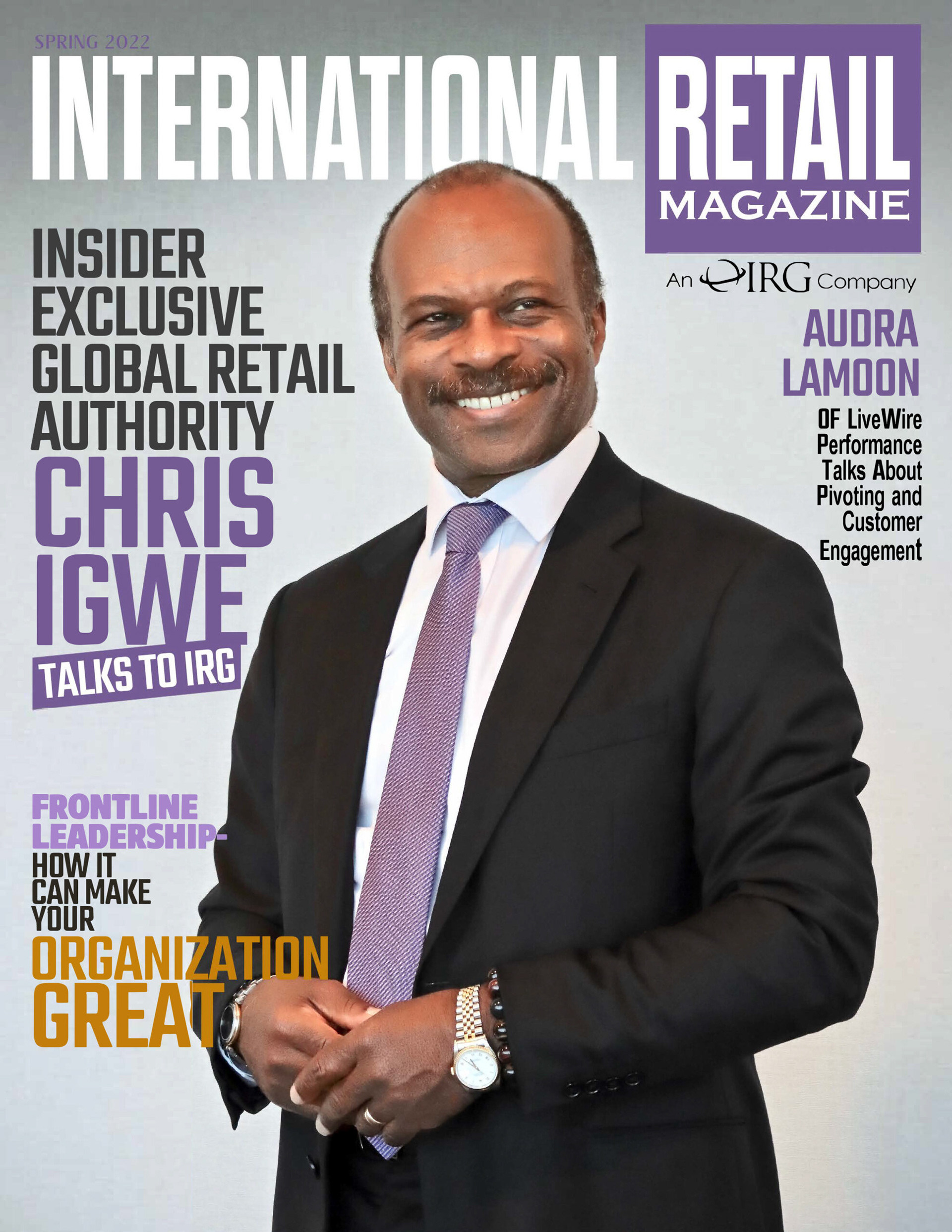
The Global Voice of Retail Chris Igwe, shares the latest trends.
Jane Symour shares her secret to longevity and health.

Linda Johansen-James interviews the founders of Barbell Apparel, and their extraordinary expansion during COVID.
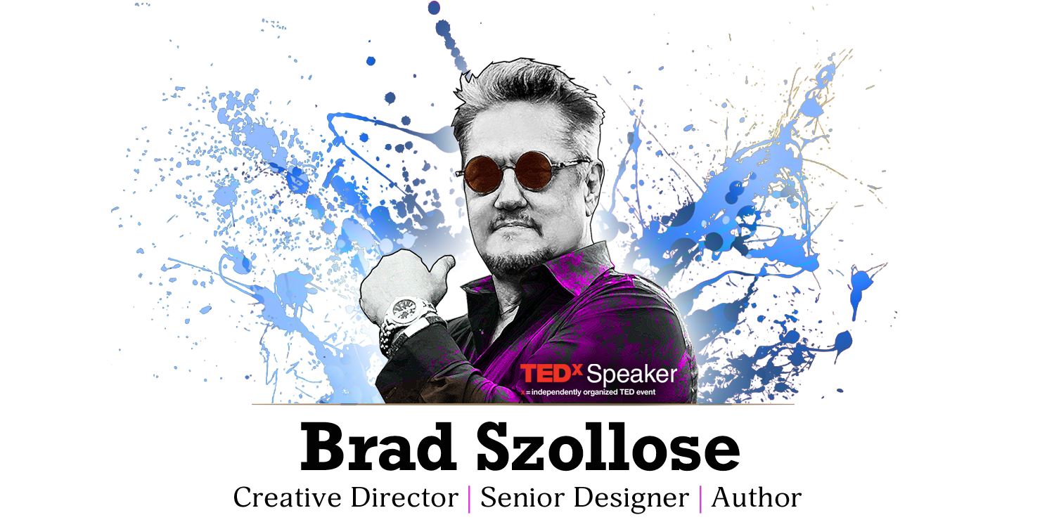
My favorite part is the digital illustration I bring to every cover.
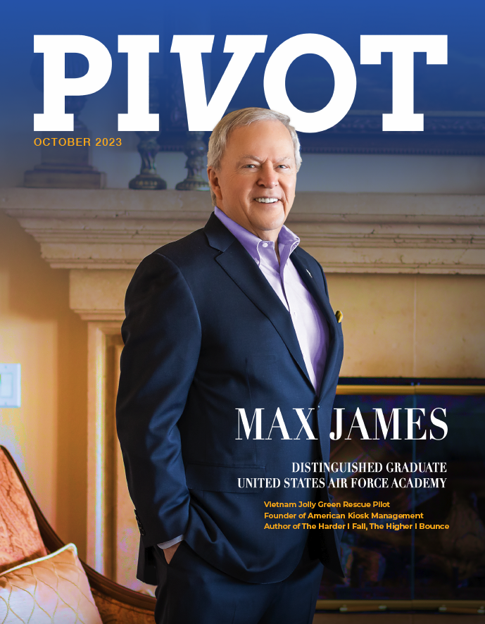
With that said, when he was was asked to be the cover story in Pivot Magazine, I created a cover as a comp to set the tone...little did I know that their designer would use my work exactly as you see above.
Then added a blue gradation to make the logo pop. I left it up to their designer to eliminate the blue and just have the background or use the blue as is.